ALBREEM — Brand identity
One identity for a family spread between Palestine and the diaspora: an emblem, a palette and a usage guide.
- Role
- Identity design and guidelines
- Tool
- Illustrator
- Languages
- Arabic and English logo
- Status
- Brand identity case study
01The problem
The family spans generations and households across Palestine and abroad. It needed one official identity that respects its heritage and works on letterheads, digital platforms and community projects.
02The approach
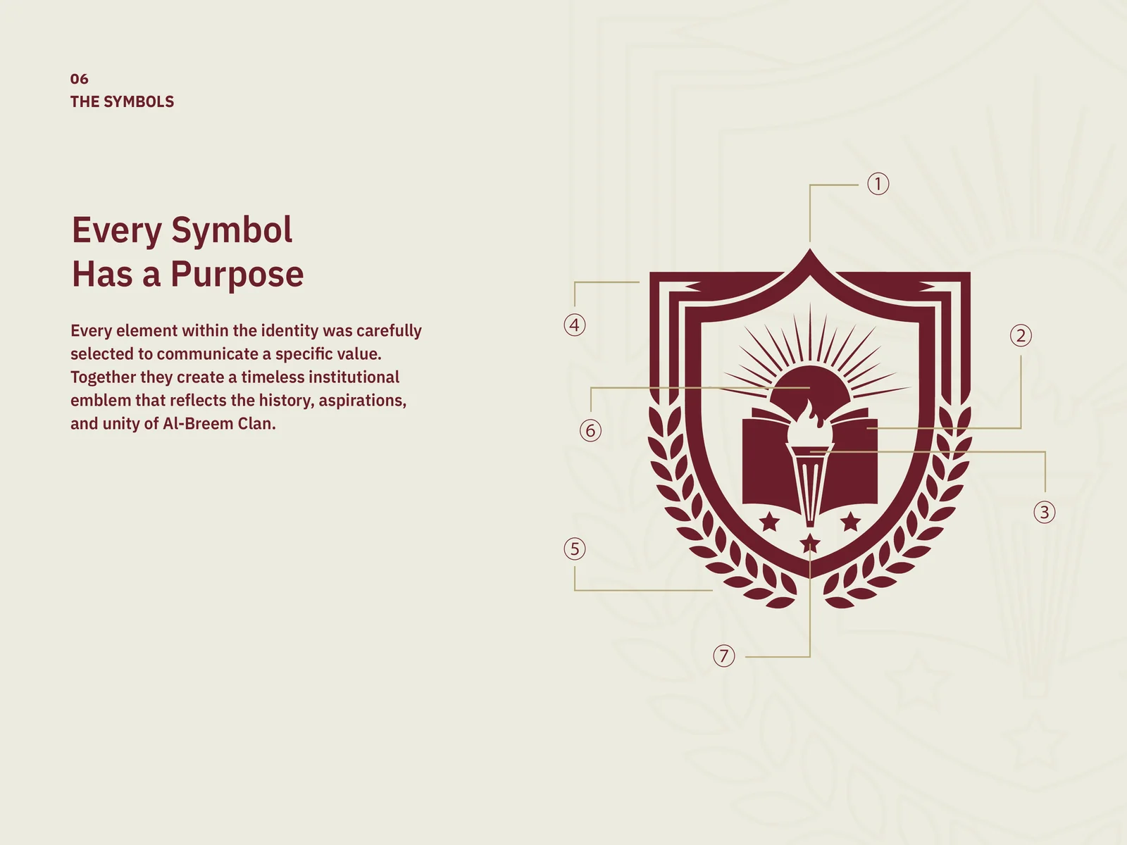
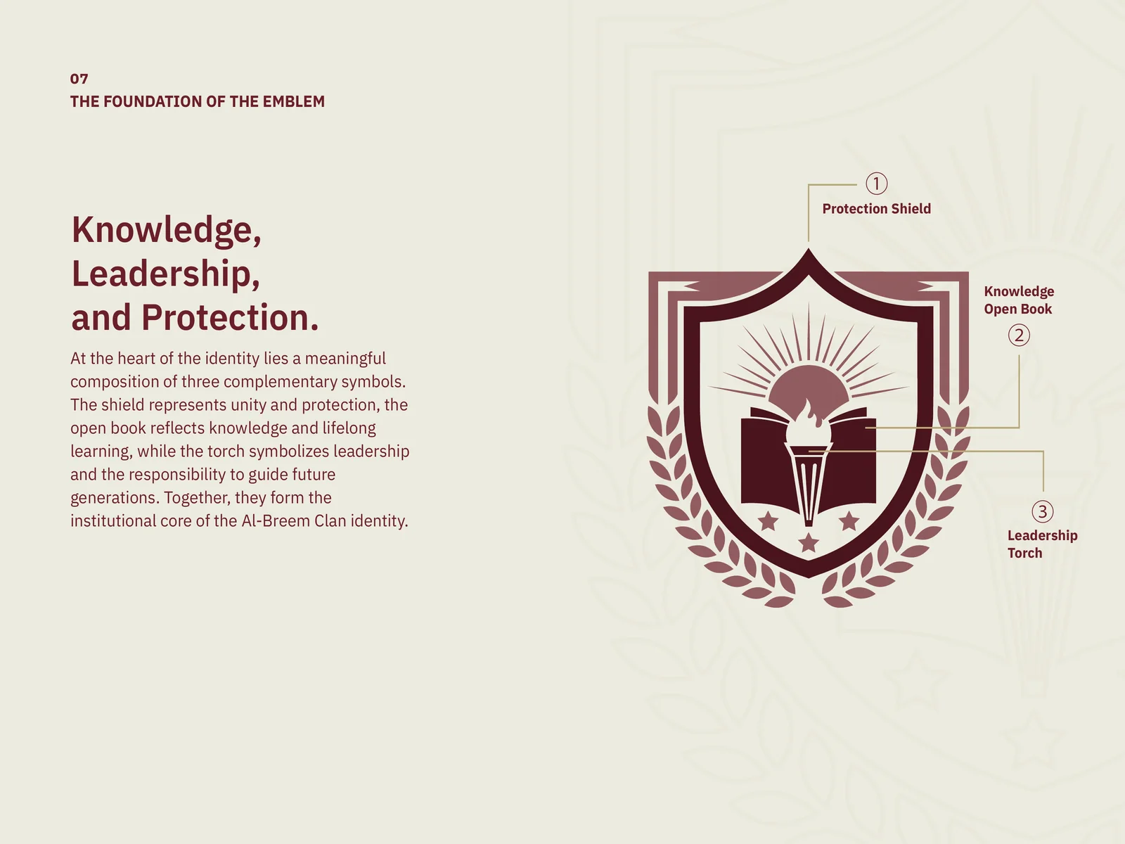
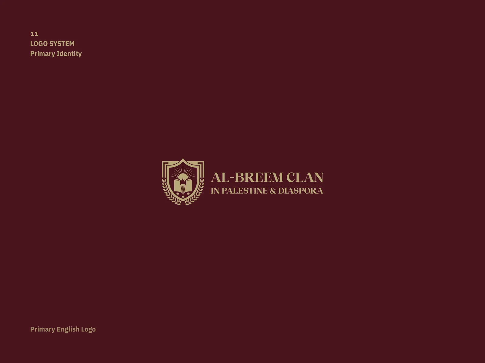
Every element of the emblem carries a meaning: the shield for protection, the open book for learning, the torch for leadership, the Palestinian flag for belonging, the rising sun for hope. The colours come from the place: Jerusalem stone, wheat fields, wrought iron and embroidery, ending in burgundy and gold.
03What exists
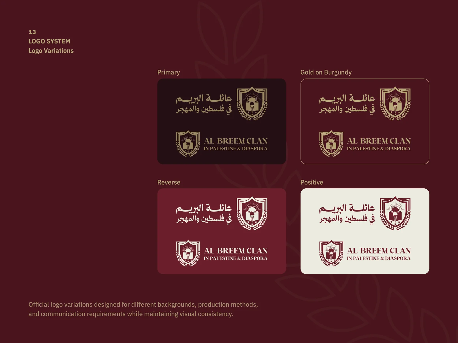
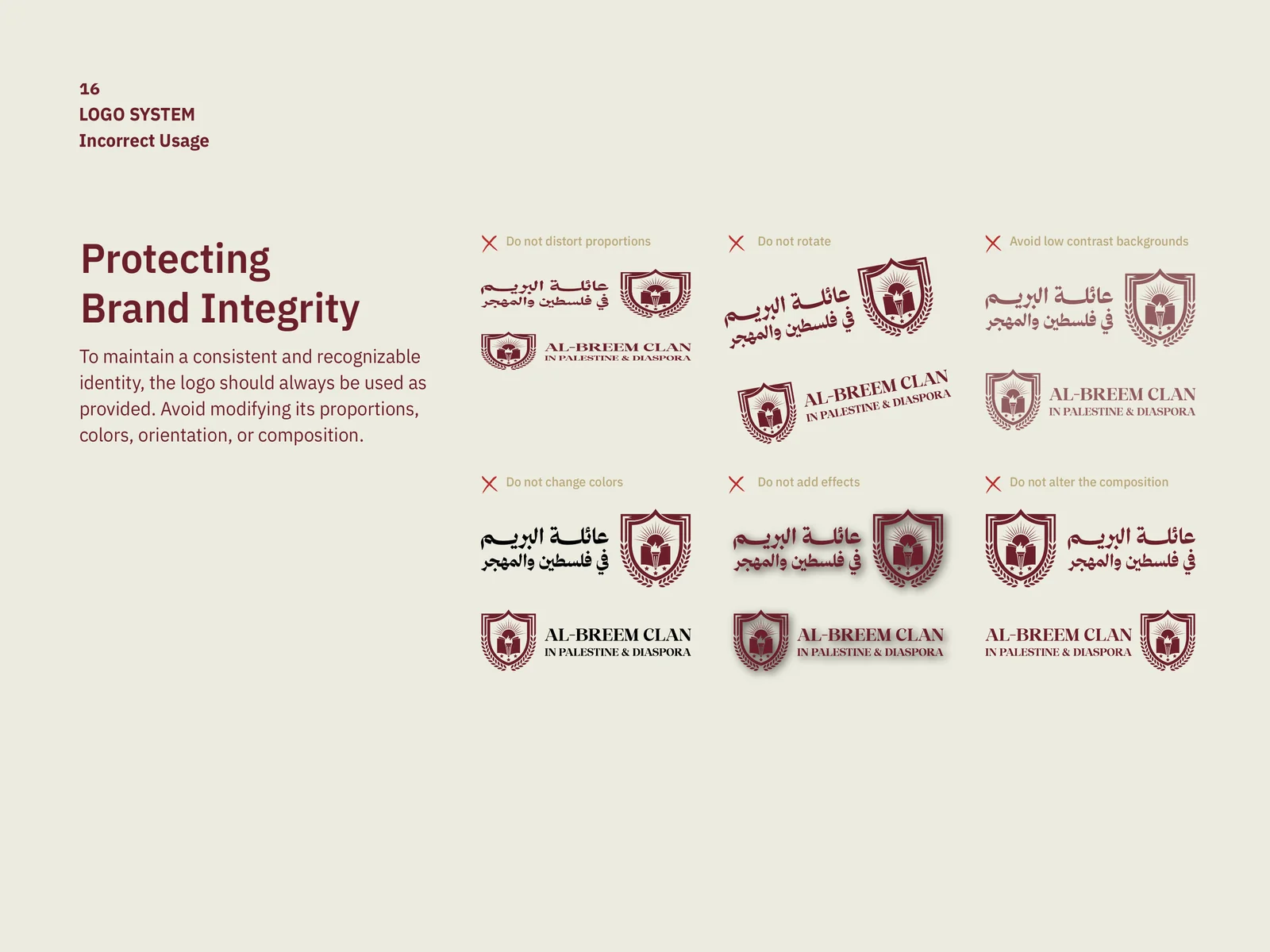
The guide covers the brand story, the challenge and objectives, each symbol explained, the Arabic and English logos, colour variants (gold on burgundy, reverse, positive), clear space, minimum size and incorrect uses.
04Where it stands
A bilingual identity system, documented in a usage guide from the emblem to the don'ts.